The current implementation puts all Private Space apps, as a linear list, at the end of the Owner profile apps. With large number of apps in Private Space, accessing those apps becomes unwieldy. I propose moving Favorite Apps column from the right edge to the center and adding a left-edge alphabet for Private Space apps.
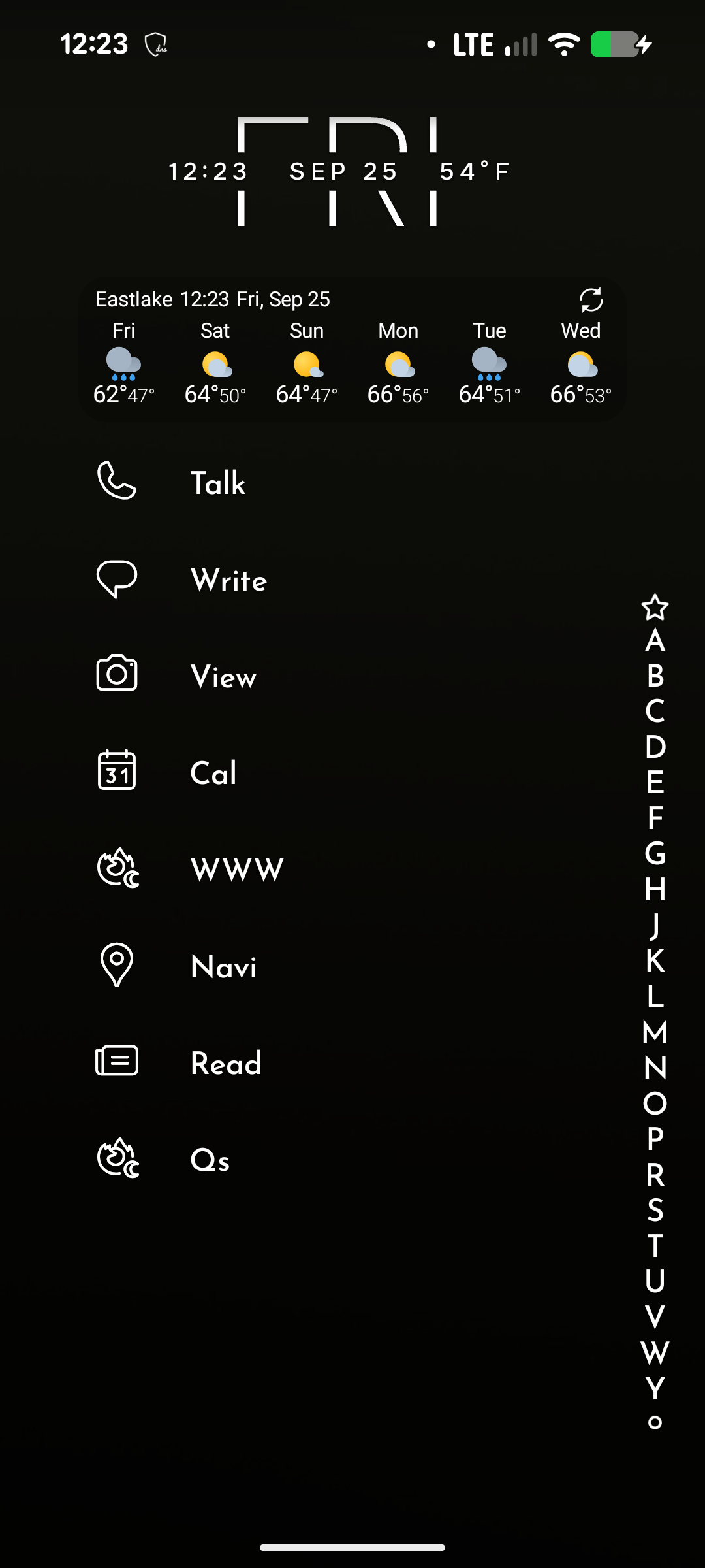
Image #1: current home screen on my Pixel 8
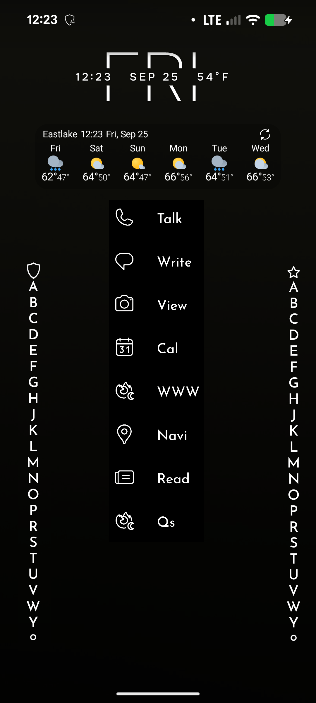
Image #2: Proposed layout.