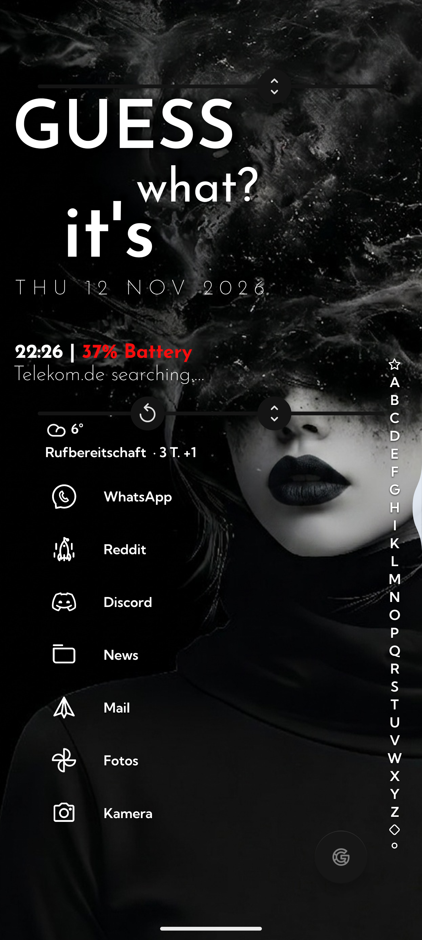
More Widget space with disabled status bar
For me Niagara is about simplicity and making the most out of your screen real estate.
I always noticed that widget space at the top is limited too much, especially if you go with a disabled status bar.
I would love to see that you can expand widget space at the top more.
Otherwise this is just space which you are forced not to use. For example in this setup it would be nice to push the widget space up top more.
- Category
- Customization
Log in to comment and vote
No comments yet
Be the first to share your thoughts.